
How to Prepare Small Business Label Artwork for Printing (Checklist)
Nuho India Team
Nuho Creative Team
Key Takeaways & TL;DR
- Three different lines run through every label file, and confusing them is what produces white edges: the trim line where the blade lands, the bleed that runs past it and the safe area that sits inside it.
- Design on a screen in RGB if you like, but deliver the file in CMYK, because ink is subtractive and a bright screen blue is not the same blue on a bottle.
- Export at 300 dpi at full final size, convert every font to outlines, embed every linked image and send a PDF rather than a flattened JPEG.
- Reserve room for India's mandatory declarations before you design the pretty half, because net quantity, MRP inclusive of all taxes and the manufacturer's address are not optional.
- Read the file at 100 percent zoom against the printer's template before you approve it, since a layout that looks tidy on a laptop can still sit outside the safe area.
label, kraft, brown, paper, tag, template
How to Prepare Small Business Label Artwork for Printing (Checklist)
Short answer: Small business label artwork is print-ready when it has bleed past the trim line, a safe area that keeps type clear of the cut, CMYK colour at 300 dpi with the fonts converted to outlines, and a reserved panel for the declarations Indian law prints on pre-packaged goods. Get those four right and nothing about the file needs guessing.
Key Takeaways
- Three different lines run through every label file, and confusing them is what produces white edges: the trim line where the blade lands, the bleed that runs past it and the safe area that sits inside it.
- Design on a screen in RGB if you like, but deliver the file in CMYK, because ink is subtractive and a bright screen blue is not the same blue on a bottle.
- Export at 300 dpi at full final size, convert every font to outlines, embed every linked image and send a PDF rather than a flattened JPEG.
- Reserve room for India's mandatory declarations before you design the pretty half, because net quantity, MRP inclusive of all taxes and the manufacturer's address are not optional.
- Read the file at 100 percent zoom against the printer's template before you approve it, since a layout that looks tidy on a laptop can still sit outside the safe area.
What print-ready actually means for a label artwork file
A label artwork file is print-ready when a printer can run it without interpreting anything: the geometry is defined to the millimetre, the colour lives in the ink space the press uses, the images hold up at final size and the type will not move when the file opens on somebody else's machine. Almost every reason a label file comes back is file-level rather than creative, and every one of them is avoidable in the first draft.
The fixes are unglamorous. Planet Label's artwork specifications group them under plain headings: make sure your text is inside the safe area, converting text to outlines, embed all referenced image files, and all black color swatches pure black at 100% K [1].
A label is also not the same purchase as a sticker. Our guide to custom labels for small businesses in India covers face materials, adhesives and what has to survive a humid monsoon in transit, while this article is about the file you send before any of that is chosen.
Bleed, trim and safe area: the three lines your artwork depends on
Three lines run through every label file, and each one does a different job.
Bleed is the area outside of the trim line that will get cut off, and on Planet Label's artwork page a minimum of 0.0625 inch of bleed is required on all sides [2].
The exact number moves with the printer and the process. Bleeds in the metric system generally are 2mm-5mm from where the cut is to be made, a standard bleed is about one-eighth of an inch or very similar 3 mm, and die-cuts sometimes require a 1/4 inch bleed because of the possible movement of the paper during the die-cut procedure [3].
The safe area is the mirror image of bleed. In Planet Label's own words, the safe zone is the area within the cut/trim line where important text and graphics will not be trimmed off the label, and it asks for a minimum of 0.0625 inch inside the trim line on all sides [4].
For Indian labels printed at small sizes, 3 mm of bleed and 2 mm of safe area are comfortable working numbers that sit inside the metric range printers actually quote. Extend the background colour itself into the bleed rather than only the outline, so a cut that lands slightly off centre still looks deliberate, and keep logos, net quantity and MRP inside the safe area where the blade cannot reach them. If the label is a shaped die-cut instead of a rectangle, the geometry gets harder, and the cut-line rules are covered in our guide to custom stickers in any shape: artwork, bleed and cut lines.
The three lines do different jobs, and the table below is the version worth pinning above your desk.
| Line | Where it sits | Set it to | What goes wrong without it |
|---|---|---|---|
| Trim line | The finished edge of the label | The size in the printer's template | A label a millimetre larger or smaller than the pack |
| Bleed | Outside the trim line, on every side | 3 mm, with 2mm-5mm the usual range and 1/16 inch the bare minimum | A white hairline wherever the cut lands off centre |
| Safe area | Inside the trim line, on every side | At least 1/16 inch (about 1.6 mm), 2 mm when type is small | Logotypes, declarations and barcodes clipped by the blade |
Colour space: RGB for the screen, CMYK for the ink
Colour is where good designs quietly fail. The CMYK color model is a subtractive color model used in color printing, RGB displays emit light and produce additive colors, and each model has a distinct color gamut, so colors visible on one may not be reproducible on the other [5].
There is also no universal formula that converts between them. RGB and CMYK are device-dependent, and color management systems using ICC profiles are required to map between devices accurately, which is why a conversion on a laptop screen is a starting point rather than a promise [5].
The practical rule for small business label artwork is simple: design in RGB if that is where the artwork lives, convert to CMYK before export, then look at the dark blues, bright greens and reds again, because those are the hues most likely to come back duller than the screen showed.
| Question on screen | RGB (screen) | CMYK (press) |
|---|---|---|
| How colour is made | Light emitted in three channels | Ink subtracted across cyan, magenta, yellow and black |
| Bright blues and neons | Easy to display | Often outside the ink gamut, so they print softer |
| What to do about it | Design freely, then convert | Convert before export and check the result at full size |
Resolution, file format and type that will not move
Two settings decide whether a label looks sharp once it is cut down to size.
Resolution in print terms refers to the number of dots per inch an image holds [6].
Most documents prepared for upload should be 300 dpi when the document sits at 100 percent of the final print size [6].
Dots per inch is a measure of spatial printing dot density, and while DPI refers to the output resolution of a printer, PPI refers to the input resolution of a photograph, which is why a 72 ppi screenshot cannot be scaled into a sharp label image [7].
For the artwork file itself, PDF is the format to send: most any program can generate a PDF file format, and Planet Label recommends PDF for custom artwork files, with Adobe Illustrator files as the alternative [8].
Type is the other quiet failure. All fonts should be converted to outlines to avoid font substitutions and unwanted text-related changes, and all text converted to outlines also known as curves, which is what stops a missing font on the printer's machine from shifting your layout [9].
Large black panels should be built as pure black at 100% K rather than a four-colour mix, matching the artwork specification that all black color swatches are pure black (100% K) [1].
| Spec | Setting | Why it matters |
|---|---|---|
| Resolution | 300 dpi at 100 percent of final print size | Keeps edges and small type crisp at label scale |
| Colour space | CMYK, with large blacks at 100% K | Stops colour shifts and muddy dark panels |
| Type | Converted to outlines | No font substitution on the printer's machine |
| Images | Embedded in the file | Nothing goes missing between your desk and the press |
| File format | Vectors, type and bleed travel in one document |
From artwork file to a labelled pack
Nuho India cuts custom die-cut vinyl stickers from uploaded artwork in Coimbatore, Tamil Nadu, and the catalogue entry for that job is Custom Shape Stickers - Upload Your Design, listed at Rs.79. Standard orders are manufactured in 24 to 48 hours and then move 2 to 4 business days in transit, shipped pan-India through Delhivery and Bluedart to serviceable pincodes across the country.
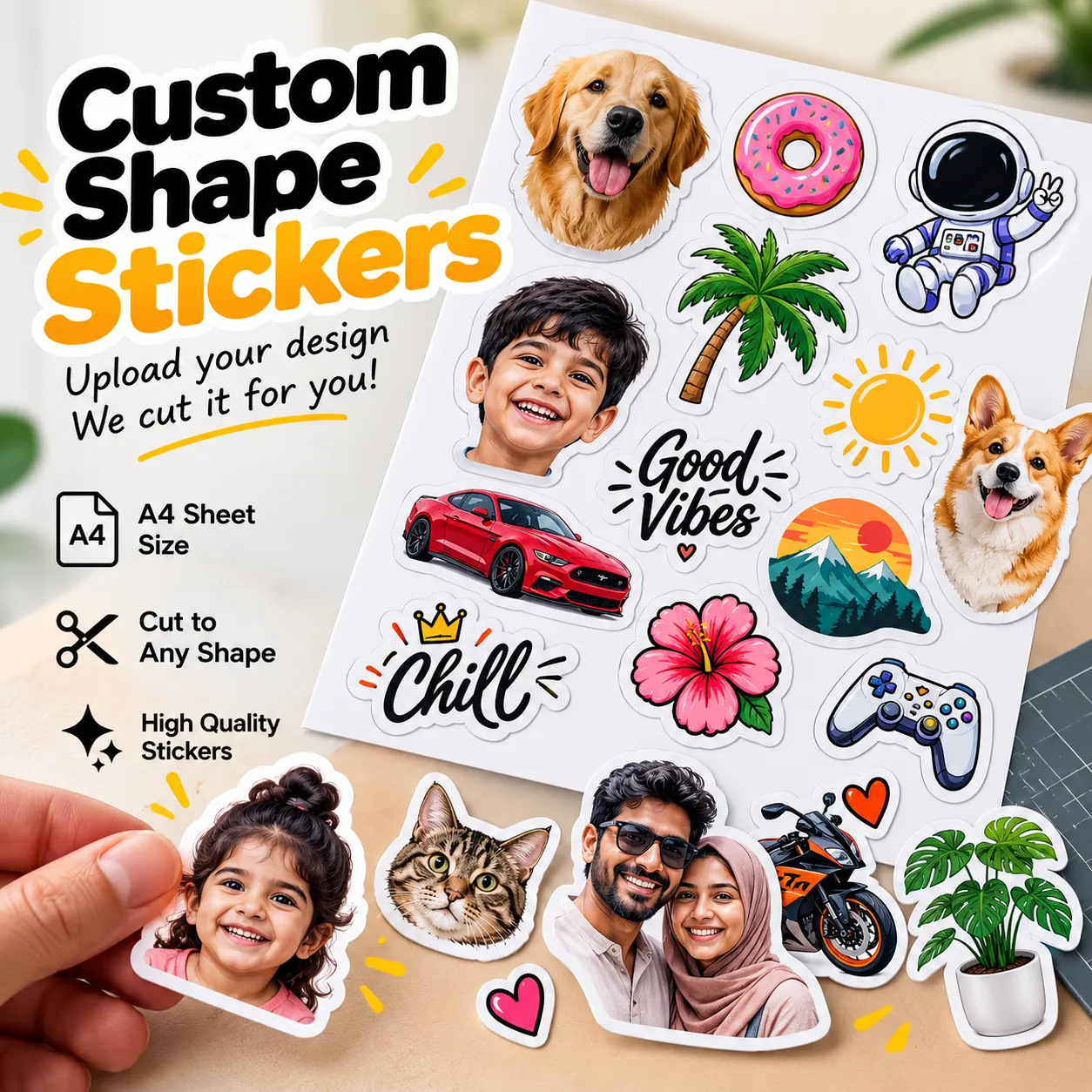 Custom shape stickers printed from an uploaded artwork file
Whether the labels arrive loose, on sheets or on a roll decides how you hand them out, and the trade-off between die-cut through, kiss-cut and sheet formats is covered in our guide to custom shape label stickers for products and packaging.
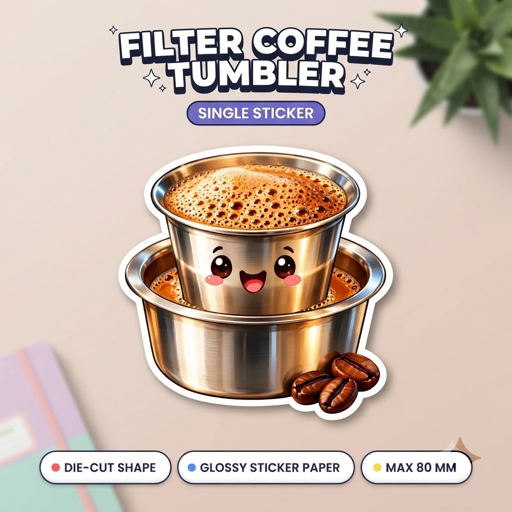
Before committing to a full label run, put one sample on the real jar or pouch. A ready-made single from the catalogue does the job cheaply: the Filter Coffee Tumbler Sticker is a glossy die-cut sticker capped at 80 mm and listed at Rs.15, which is enough to see how a glossy finish and a die-cut edge behave in your own lighting and on your own pack.
And if the label is only one part of what you are printing this season, our guide to small business branding stickers on a budget stages the spend so the parcel seal comes first and the information label second.
The panel India requires on the artwork
Pre-packaged goods are not a styling choice. As per the Legal Metrology (Packaged Commodities) Rules, 2011, certain mandatory declarations have to be made on every package, including name and address of the manufacturer, net quantity, month and year of manufacture, retail sale price in the form of Maximum Retail Price inclusive of all taxes, and consumer care details [10].
Those declarations take up real estate, so reserve their panel before you draw the logo rather than squeezing it in afterwards. The full list also carries the common or generic name of the commodity, the best before or use by date where the product can become unfit for consumption, the dimensions of the pieces where sizes differ, the unit sale price, and the country of origin for imported products.
| Declaration | Where it usually lands |
|---|---|
| Name and address of the manufacturer, packer or importer | Back panel, small type, still inside the safe area |
| Common or generic name of the commodity | Front panel, above the logo line |
| Net quantity in a standard unit of weight or measure | Front or side panel, never cropped |
| Month and year of manufacture | Back panel, beside the batch line |
| Best before or use by date | Back panel, printed space kept clear for batch coding |
| Retail sale price as MRP inclusive of all taxes | Front or back, rupee figure kept readable |
| Consumer care details | Back panel, email or phone inside the safe area |
Two habits keep this panel out of trouble. Set the type sizes for the declarations first and design around them, because a front panel that has swallowed the whole safe area leaves nowhere for net quantity to go. And remember that the pack travels through Indian warehouses and monsoon humidity, so anything that has to stay legible on a damp carton belongs on a face material and adhesive chosen for it, which is the decision our custom labels guide walks through.
The print-ready checklist for your label artwork
Run this list top to bottom before you send the file. Every row is a yes or no, and a single no is a reason to keep the file back rather than hope the printer fixes it.
| Check | How to verify it | Pass condition |
|---|---|---|
| Trim size | Compare the document with the printer's template | Matches the flat area on the pack, to the millimetre |
| Bleed | Turn on the bleed guides and look at every edge | Background runs 3 mm past the trim on all four sides |
| Safe area | Measure from the trim line to the nearest text or logo | Nothing important within about 2 mm of the cut |
| Colour space | Open the document profile | CMYK, with large black panels at 100% K |
| Images | Open the links panel | 300 dpi at final size, every image embedded |
| Type | Run create outlines on a duplicate of the file | No live fonts left anywhere in the artwork |
| Declarations | Read the reserved panel against the rules list | Every required line present, nothing cropped or reversed out |
| File | Export and reopen on another device | One PDF that opens at the right size with the bleed intact |
Frequently asked questions
How much bleed does a small business label artwork file need?
Three millimetres on every side is the comfortable number for a small label, and the common metric range is 2mm to 5mm. The bare minimum quoted by label printers is 0.0625 inch, and shaped die-cuts often ask for more because the material moves during the cut.
Is RGB good enough for label artwork?
It is good enough to design in, but not to send. Presses lay down cyan, magenta, yellow and black ink, so convert to CMYK before export and recheck the brightest blues and reds, which are the colours most likely to change.
What file format should I send for a label print?
Send a PDF, with the fonts converted to outlines and every linked image embedded. PDF keeps vectors, type, images and the bleed box in one document, which is why most programs can generate one and most printers ask for it.
Do I need space for legal declarations on a small label?
Yes, if the product is pre-packaged. The Legal Metrology (Packaged Commodities) Rules, 2011 list ten declarations that have to appear on every package, from the manufacturer's name and address to net quantity and the retail sale price, so the panel has to exist in the artwork before anything else is laid out.
Should I design the label before or after choosing the material?
Choose the material and adhesive first, then design to it. A glossy film, a matte paper and a waterproof vinyl hold colour and small type differently, and the panel sizes that work on a rigid jar may not work on a pouch that flexes.
Conclusion and your next step
Print-ready artwork is not a talent problem. It is eight checks: trim size, bleed, safe area, colour space, resolution, outlines, declarations and file format, each of which takes minutes to verify and none of which can be fixed after the plates or the roll are made.
Your next step is to open your label file against the checklist above, fix every no you find, and then send it as a single PDF to Custom Shape Stickers - Upload Your Design for a first run.
Sources
- Artwork Specifications - Planet Label
- Bleed - Planet Label
- Bleed (printing) - Wikipedia
- Artwork Safe Area - Planet Label
- CMYK color model - Wikipedia
- Image Resolution - Planet Label
- Dots per inch - Wikipedia
- Accepted File Types - Planet Label
- Converting Text to Outlines - Planet Label
- Legal Metrology - Department of Consumer Affairs, Government of India
Featured Custom Products
Frequently Asked Questions
More Articles You Might Like
Recycled Plastic in Food Packaging: What FSSAI's 2026 Draft Proposes
Yes, but only under narrow conditions. FSSAI has proposed allowing chemically recycled polyethylene and polypropylene in food-contact materials, and allowing recycled polymer made...

Brand Storytelling for Startups: How a Founder's Story Becomes a Moat
Short answer: Brand storytelling is turning why you started into a story other people can repeat back to you. It holds as a moat because competitors can copy your technology,...

On-Device AI for Indian Small Businesses: Why Work Leaves the Cloud
Indian small businesses are moving routine AI work from cloud tools to on-device AI because it keeps customer data on their own machines, cuts recurring bandwidth and cloud costs,...